
Visualising the Blackrock Strategy journey so far.
Identity and website for Blackrock Strategy, a Chicago based risk management firm who provide intelligence to multinational organisations and government clients in order to identify and mitigate potential threats to their people, infrastructure, vendors, customers, and data.
After 30 years in the government, law enforcement, and private sector service working exceptional challenges for demanding clients, Blackrock Strategy LLC decided to alter direction. Now, they share their passion by helping others meet their goals of exceptional service and pursuit of great opportunities to succeed in government and private sector challenges.
The developed monogram represents that of a path, or route, by combining the B and S initials of the name. This concept and execution is to indicate the fact that Blackrock Strategy’s expertise lies in advising their customers the best course of action, or route, to take in a particular set of circumstances.


The associated Blackrock Strategy wordmark is set in FF Mark Pro (Extra Light), a strong and simple geometric sans typeface which works harmoniously with the characteristics of the monogram.

The aesthetic of the Blackrock Strategy monogram, with its thin strokes and sharp geometric shape, lend itself well to developing a bespoke set of icon illustrations to be used throughout the identity, both in print and web.

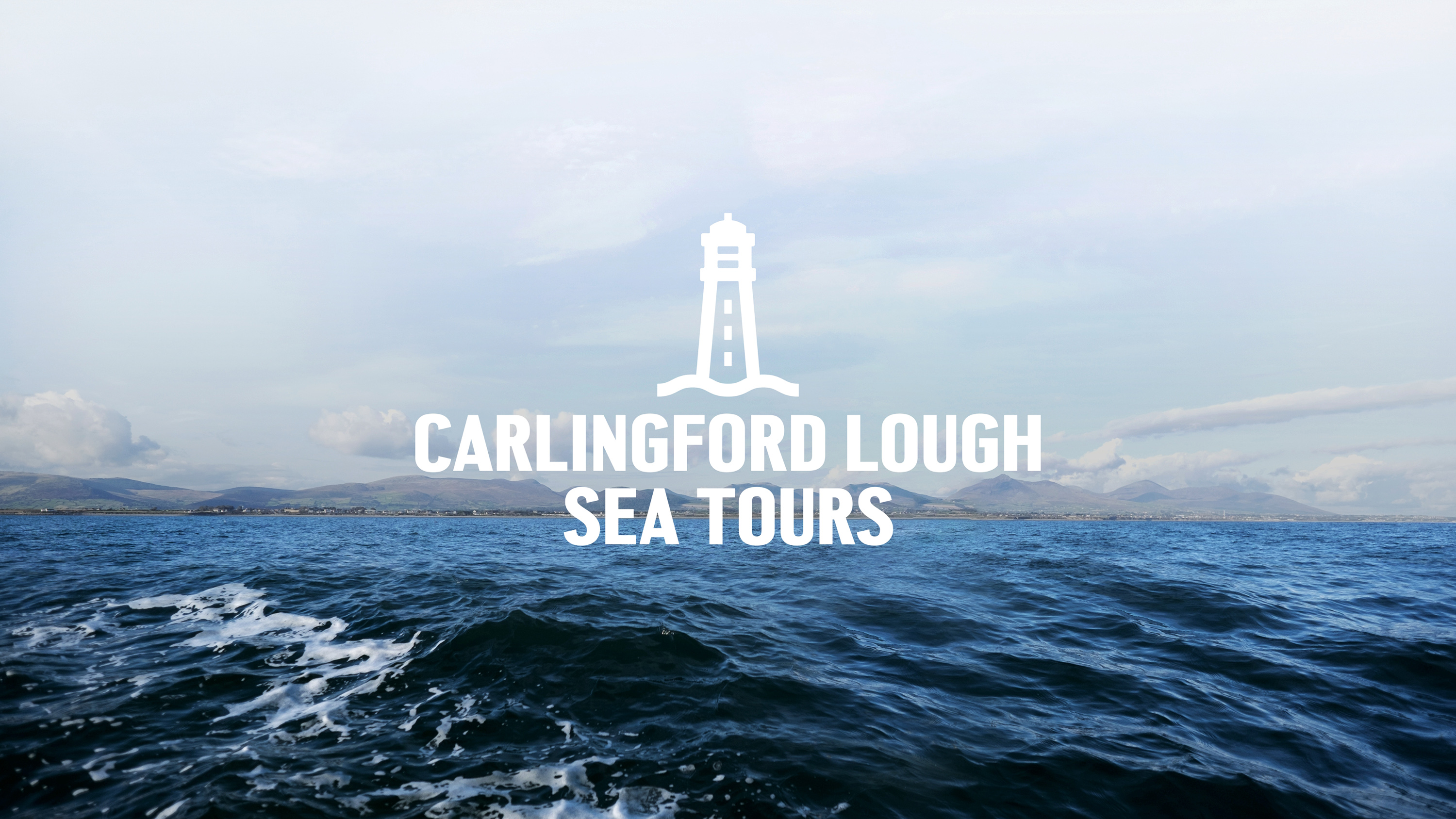
Capturing the spirit of the ocean for Carlingford Lough Sea Tours.
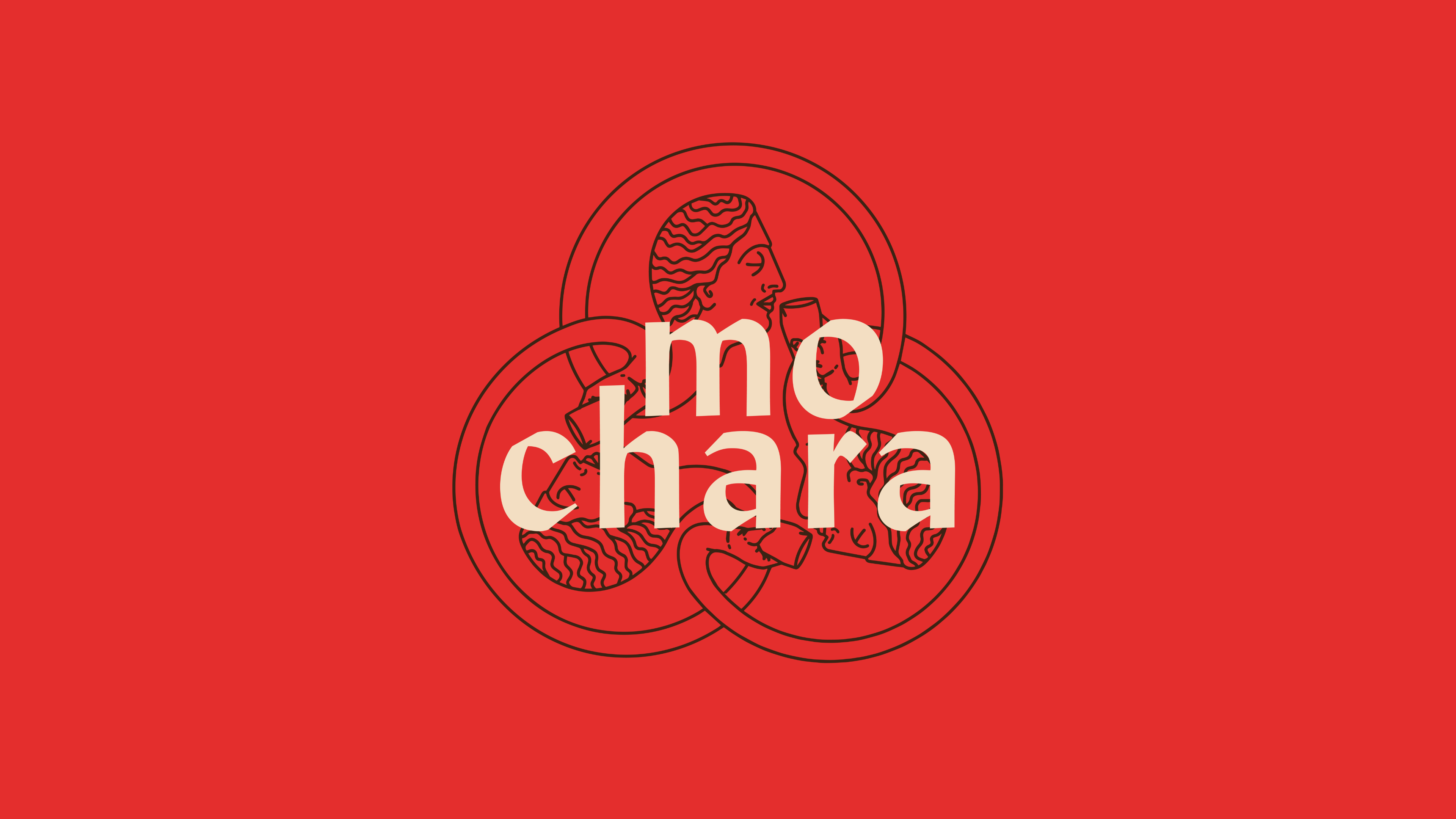
This round is on us. Mo Chara; branding Dundalk’s first taphouse.
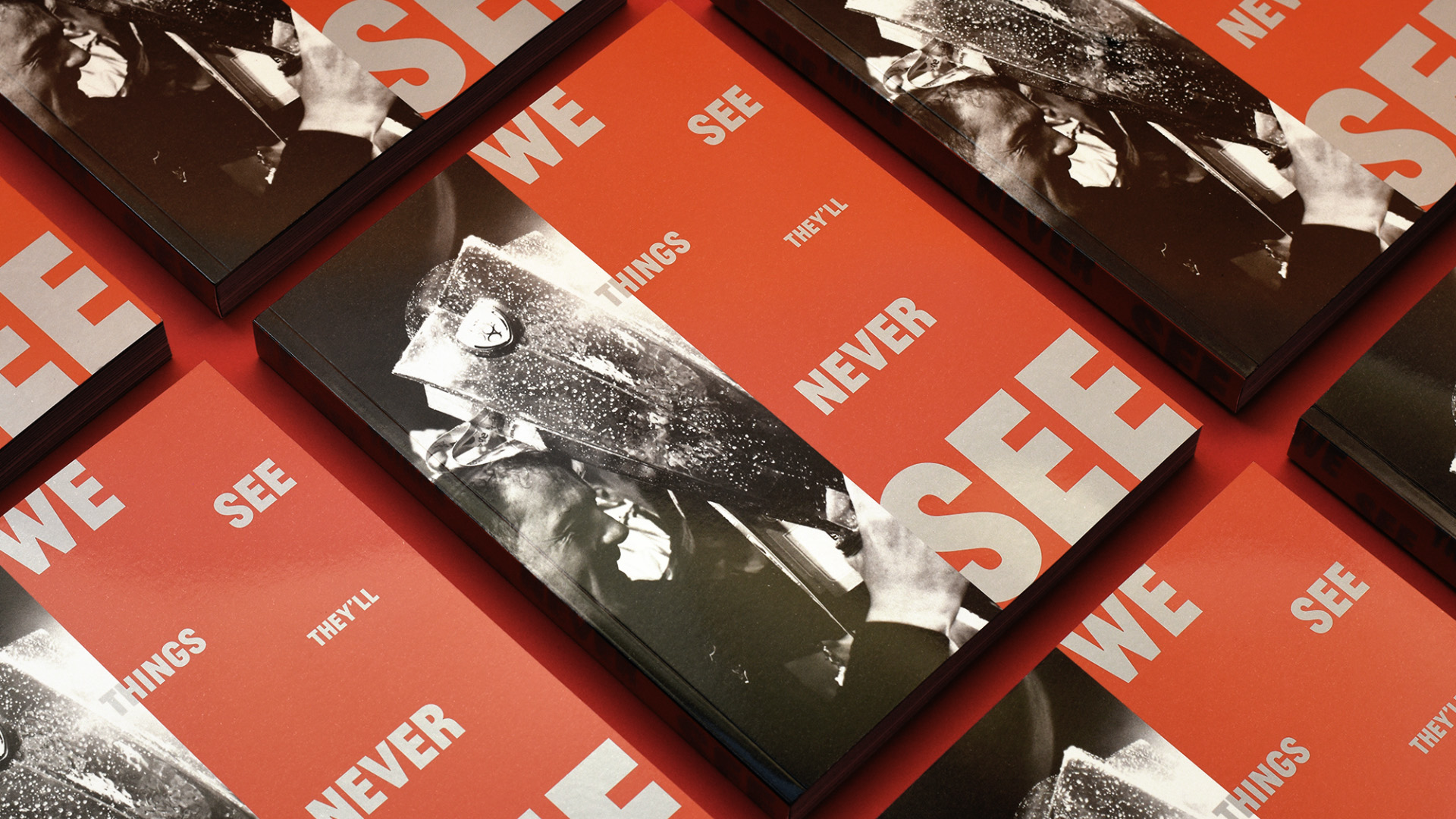
Another season, another league title, another book for Dundalk FC.