This round is on us. Mo Chara; branding Dundalk’s first taphouse.
A Community for Mo Chara, Do Chara & Ár gCairde.
Three lifelong friends with the one dream, to open their own pub... This dream became a reality when, in 2021, Cillian, Vincent, and Paul opened the doors of Dundalk’s First Taphouse, Mo Chara. Located in the former ‘Century Bar’, an historic landmark building of the town, this specialised bar and location venue creates a unique experience for the senses, inspired by the world's most iconic taprooms.
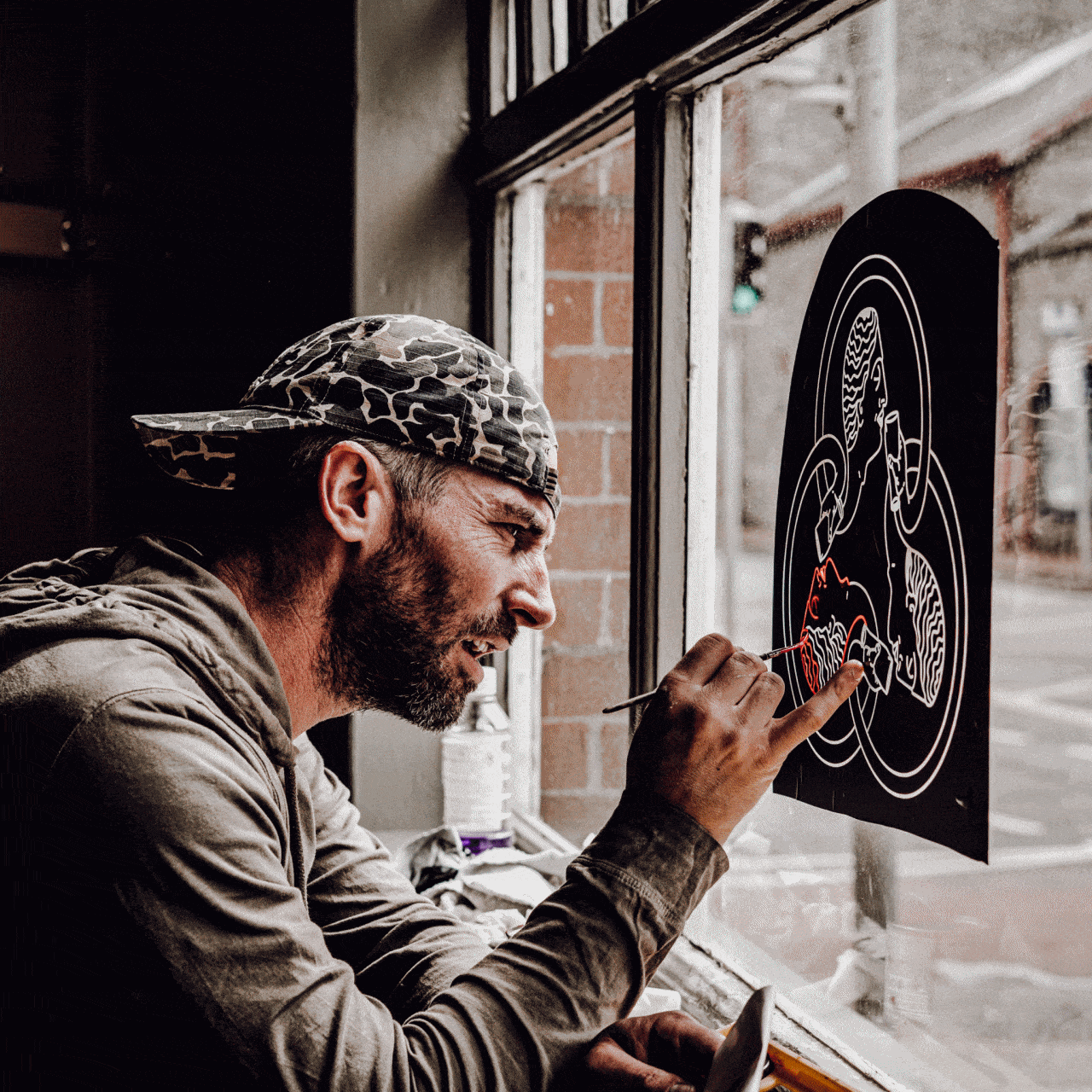
Expert sign writing / street signage restoration by Andy Greaves of Wonders and Signs.
Additional video and photography work by Sapient Media Ireland.

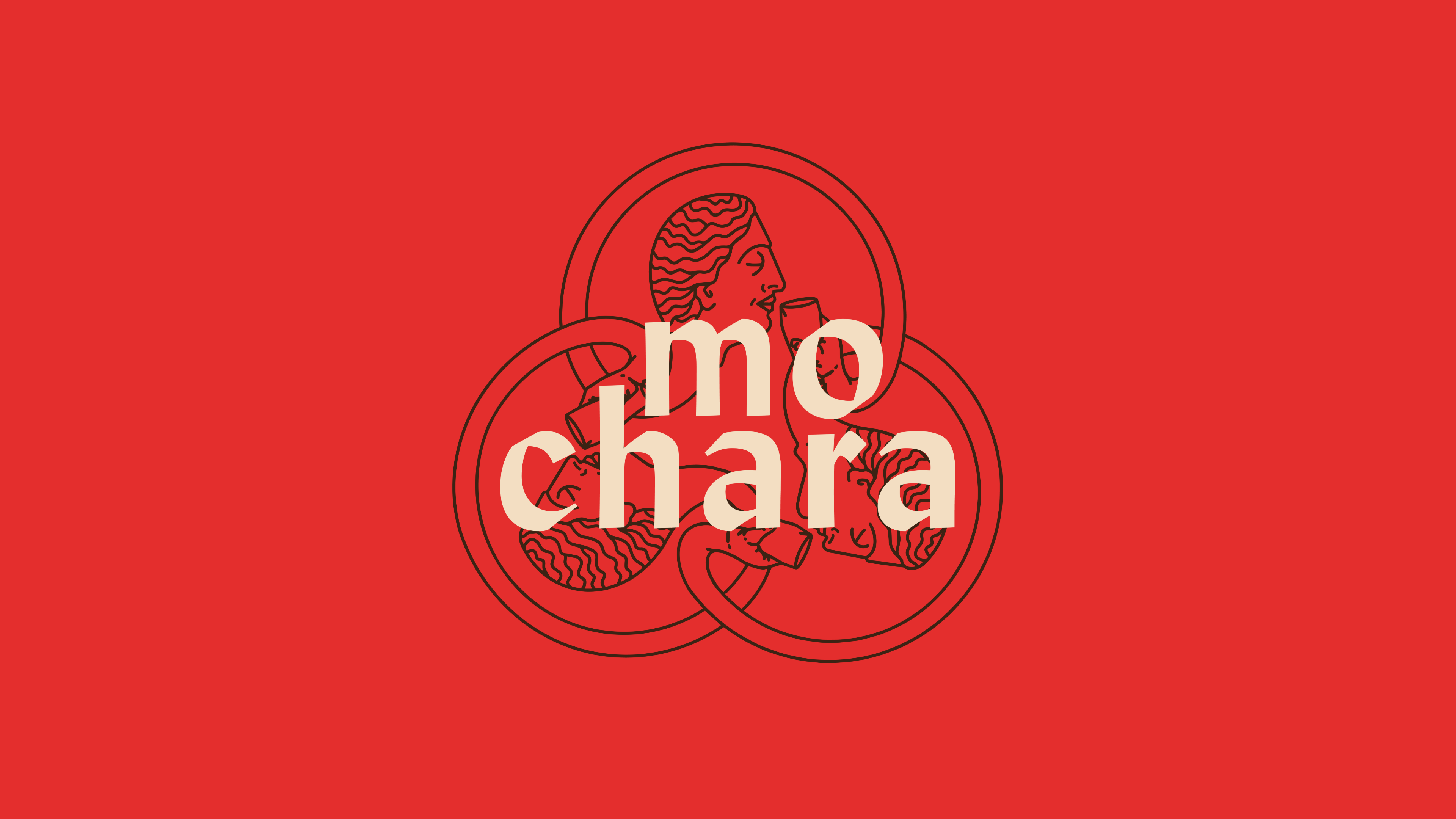
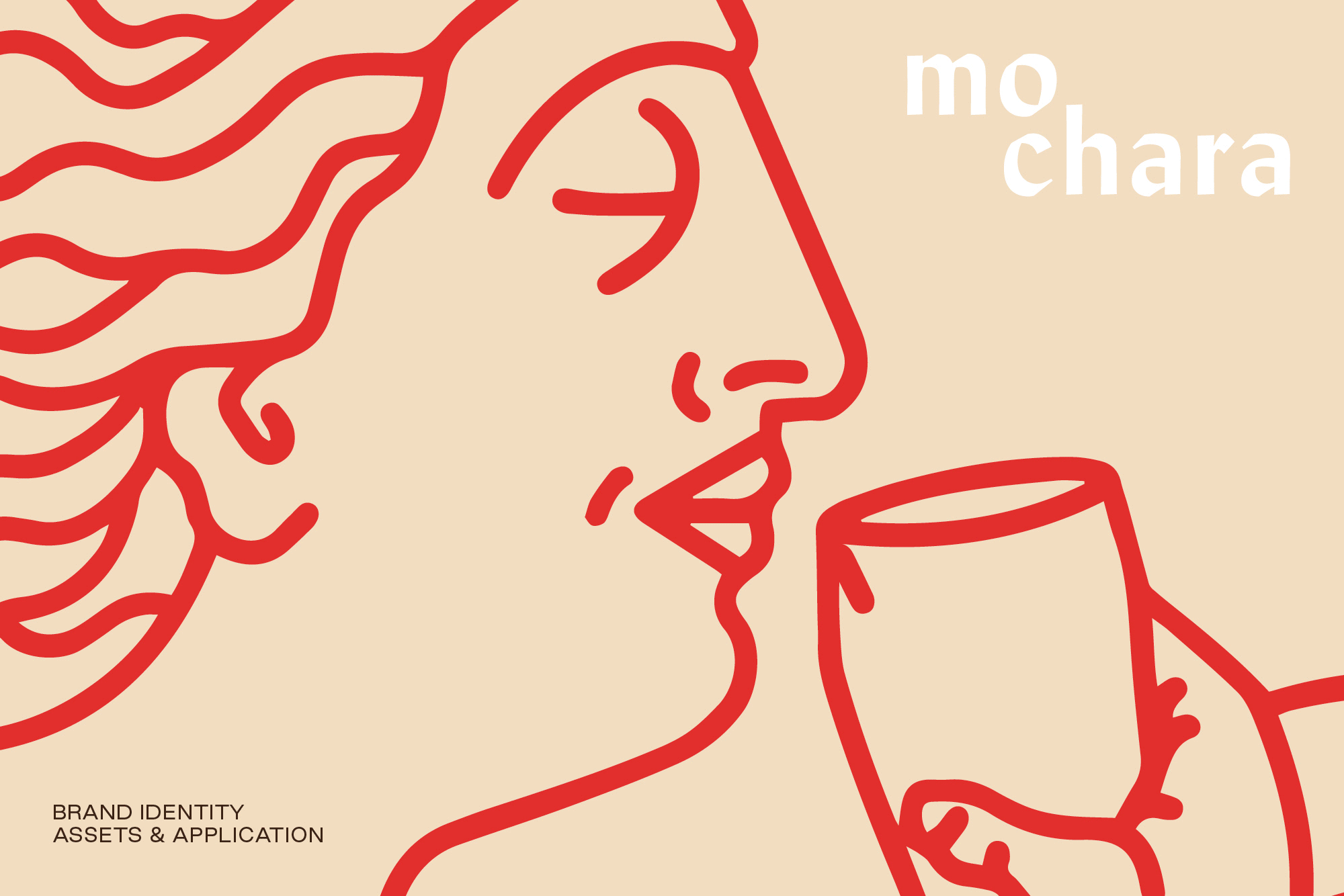
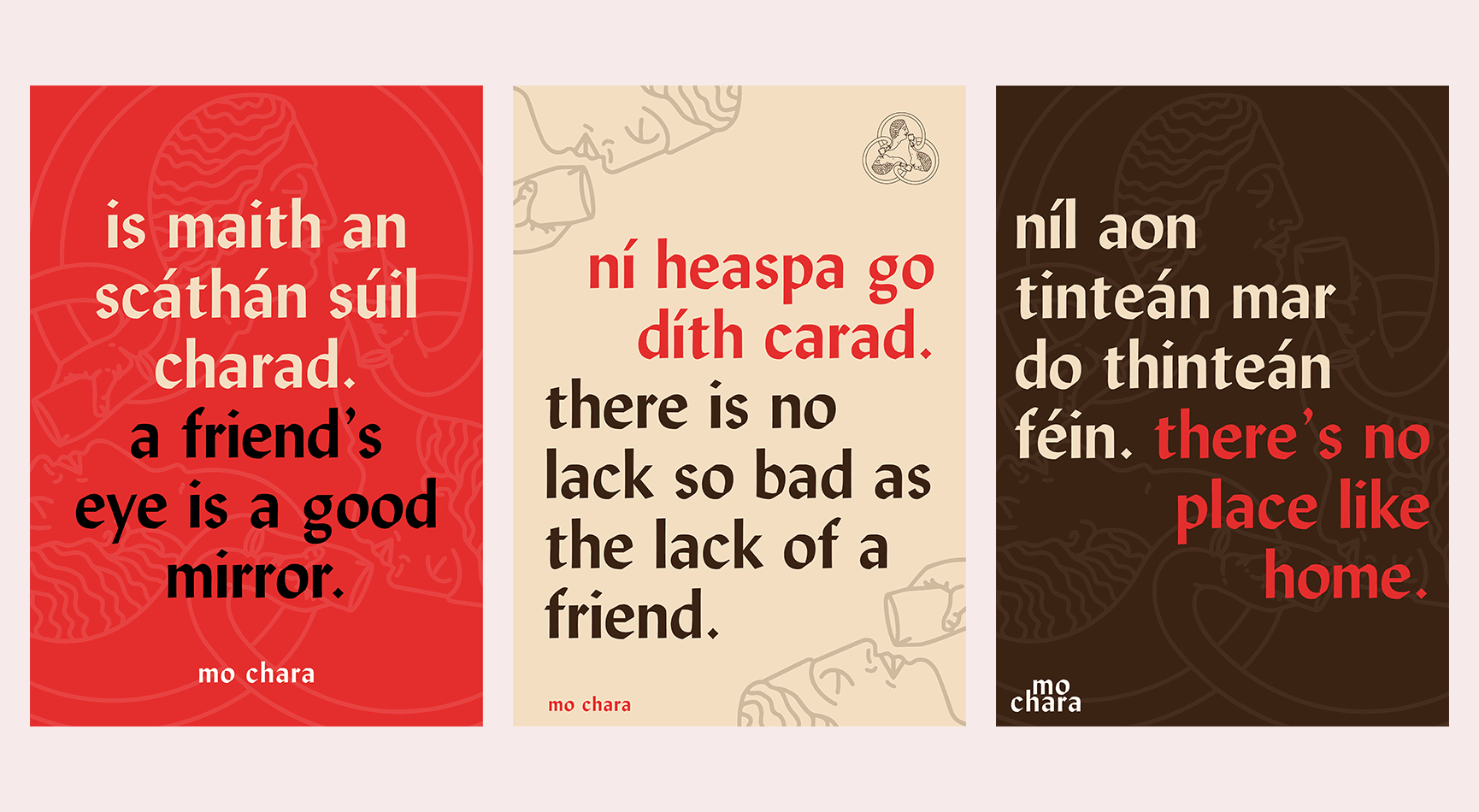
Based around the concept of friendship and unity, we interpreted the Celtic circular symbol for friendship, to create a “Grecian, Wildean eternal circle of pint drinking” motif for the brand identity.


Using the typeface Lydian, with its humanist calligraphic characteristics, a nod to Uncial type and tied in with the Gaelic premises name.


The location itself, an architectural listed building from 1902, as designed by Terrance McDonald, fed into the brand design and inspired us to produce a brand that was complementary to the character and soul of a very historic building.


The brand colour red being a nod to the oxide red brick colour used on facade synonymous with Dundalk and its famous brewery heritage.
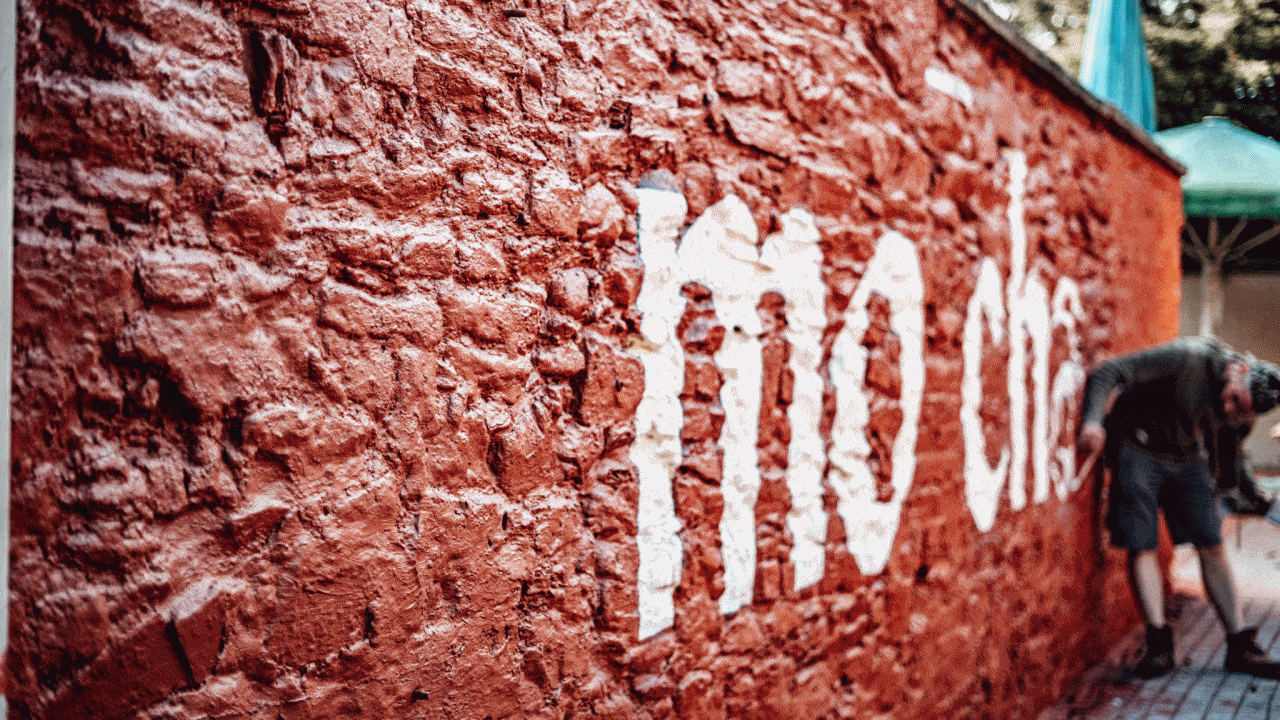
We worked with the Mo Chara team to ensure all the original features of the facade and entire were given the shine they deserved, highlighting rather than covering over.


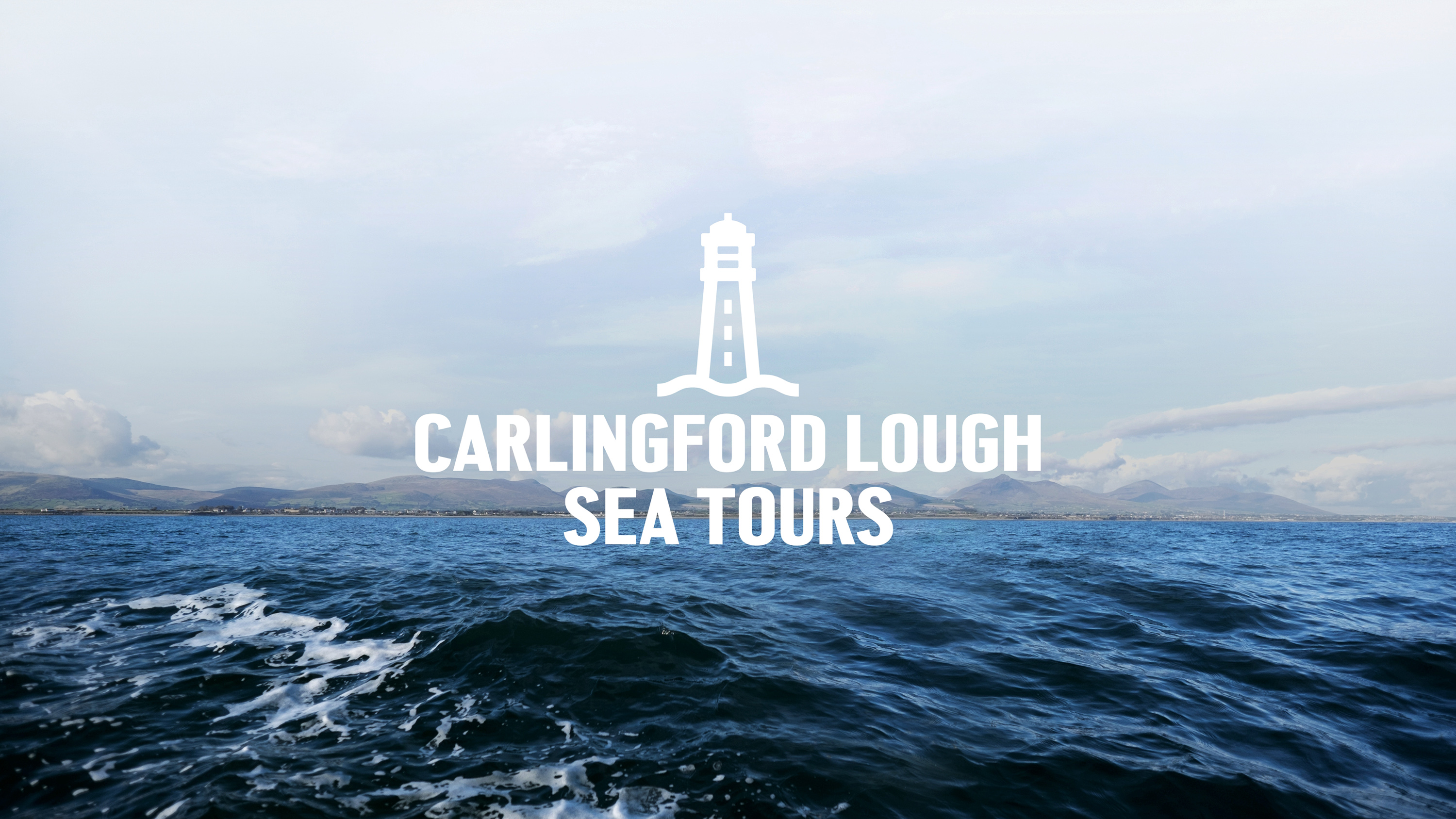
Capturing the spirit of the ocean for Carlingford Lough Sea Tours.
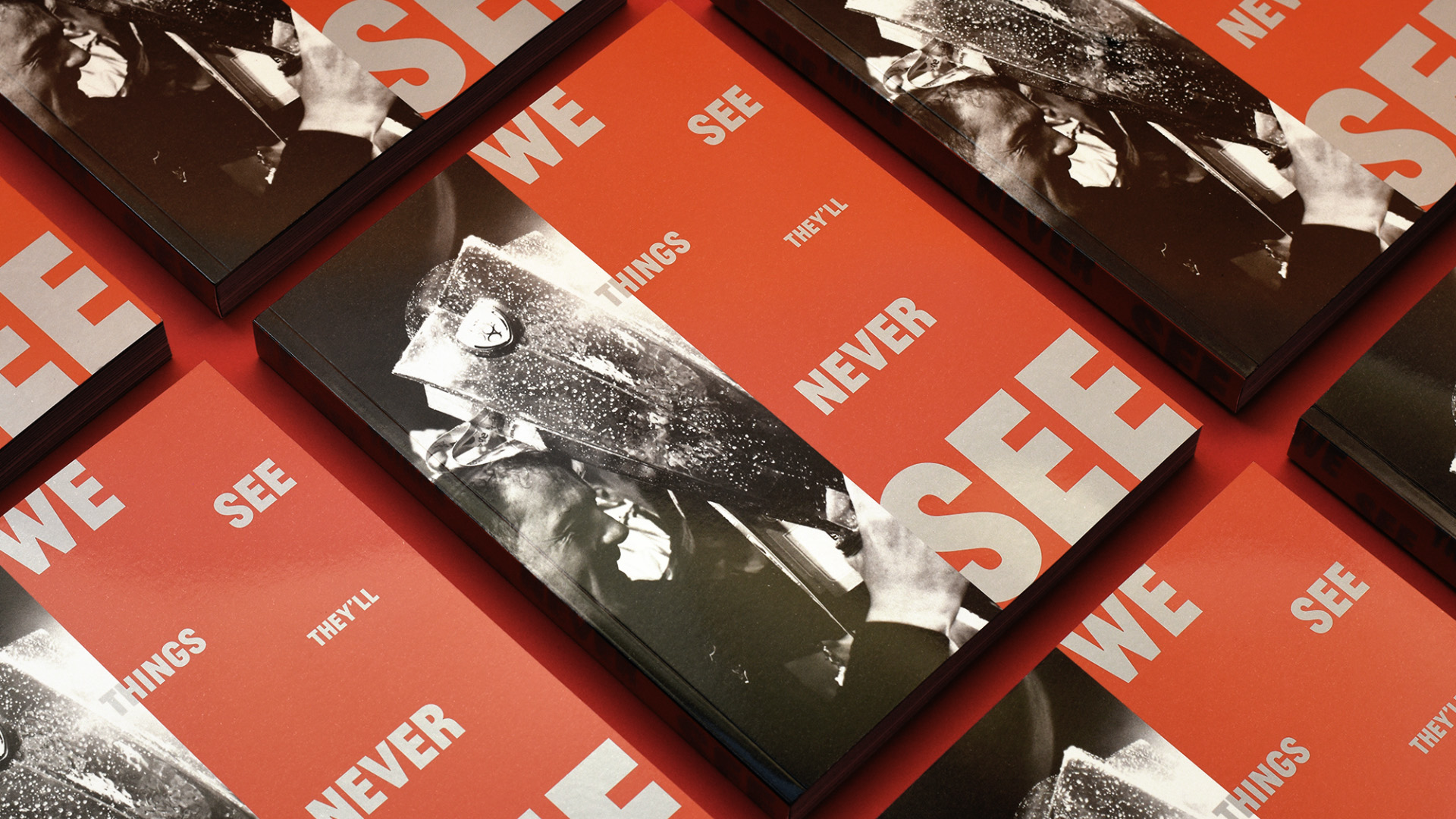
Another season, another league title, another book for Dundalk FC.
van Dijk Architects —
How to take a drawing and make a brand.