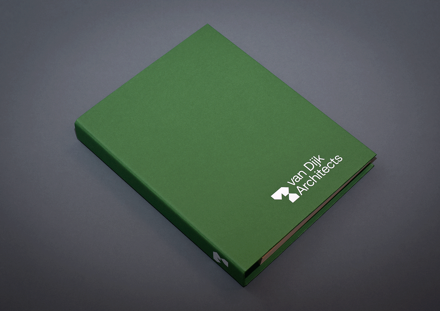
van Dijk Architects —
How to take a drawing and make a brand.
International architecture practice, van Dijk Architects have been operating for over 20 years. We were tasked with modernising their brand identity, while staying true to their original hand-drawn illustration element of their original branding.
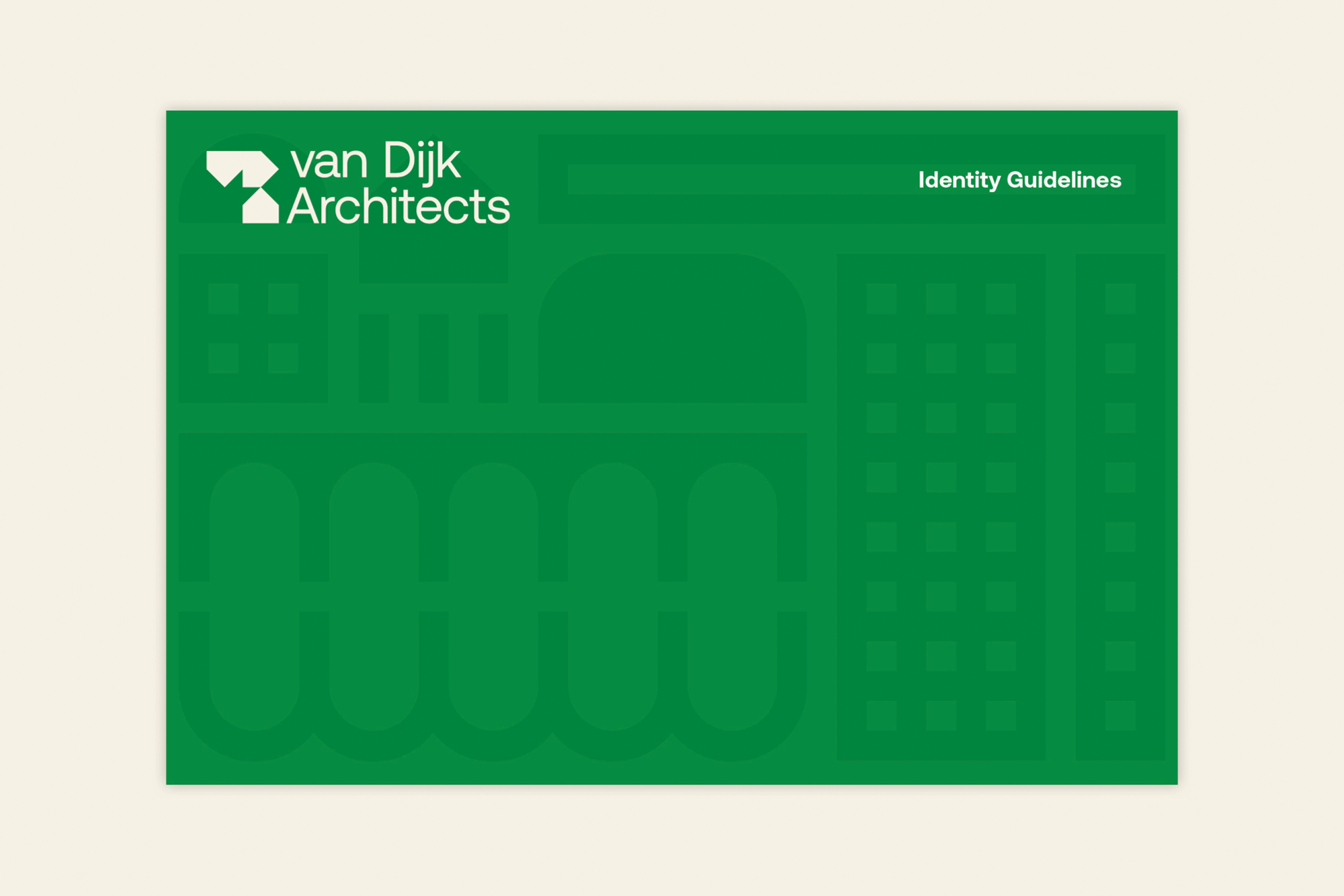
Based off the previous illustrative brand identity, we modernised and re-imagined the VDA brand, creating a modular and contemporary logomark and bespoke illustration, reflecting the various architectural sectors they work within, using form and shape in a modular and adaptable way.
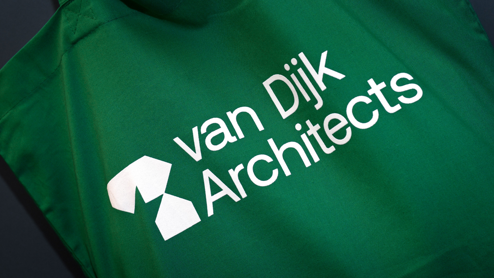
The VDA logomark is also representative of architectural forms and building blocks, which can be adapted, stacked, switched and built upon. An adaptable logo mark which is inspired by the classic shape of a building, which when duplicated and rotated, also symbolises the VDA initials. The outcome is Dutch in it’s design aesthetic. It’s modular, grid system allows for playfulness in what is effectively quite a industrial, staunch mark.

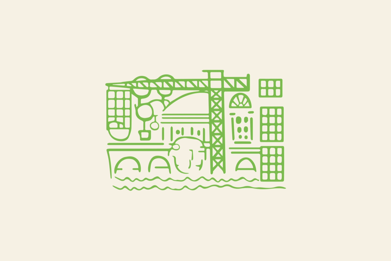

Based on an illustration by the co-founder of the practice, Ingrid van Dijk, depicting illustative architectural forms, we modernised and updated this. Creating a modular suite of illustrative graphic forms.


Using a reductive colour palette, featuring G.F Smith Lockwood Green paper stock, and Aeonik typface by Co Type Foundry. As a legacy brand colour, green was to be retained and refined. As it is symbolic of the businesses Irish roots, along with the ecological connotation.


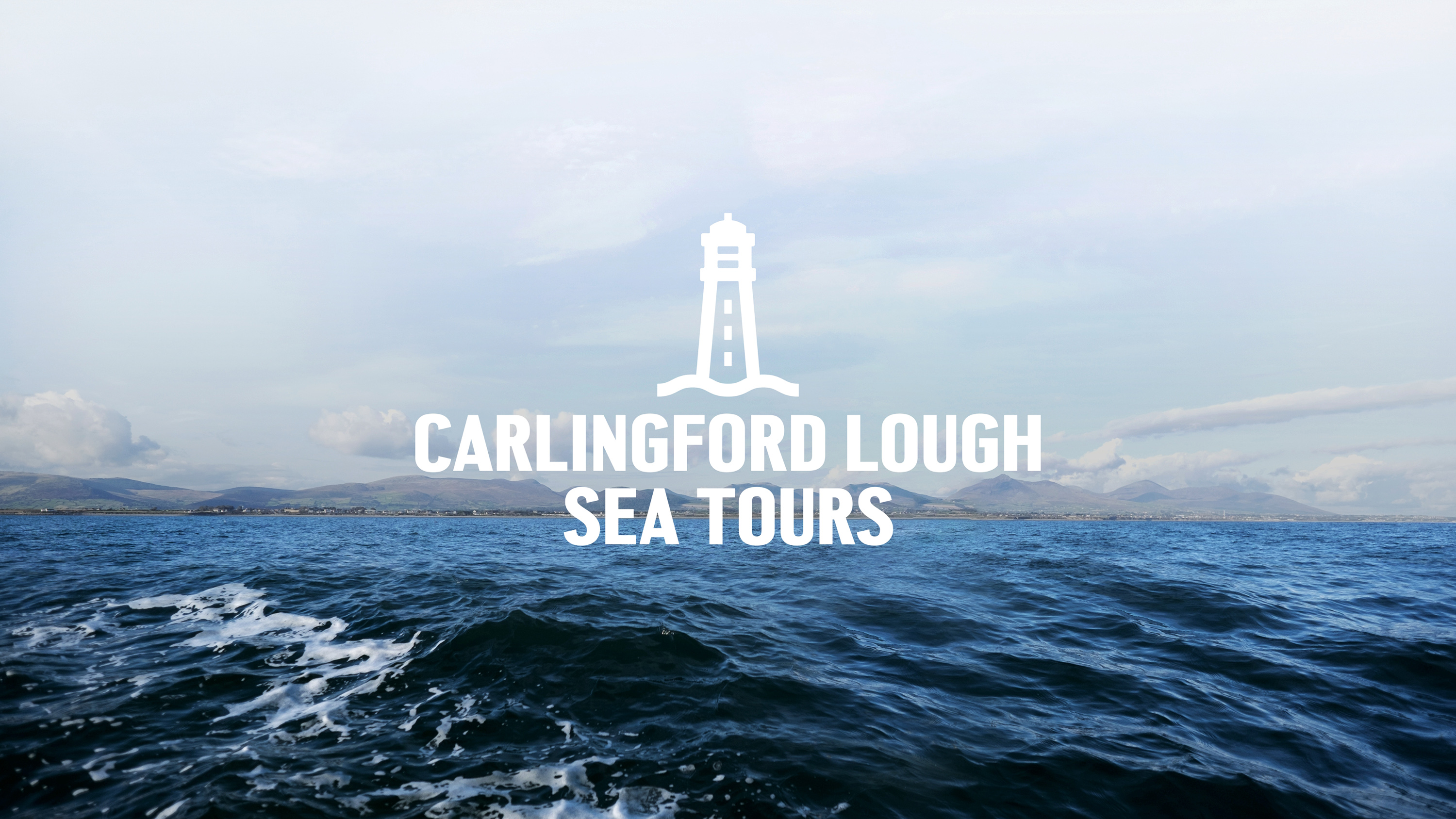
Capturing the spirit of the ocean for Carlingford Lough Sea Tours.
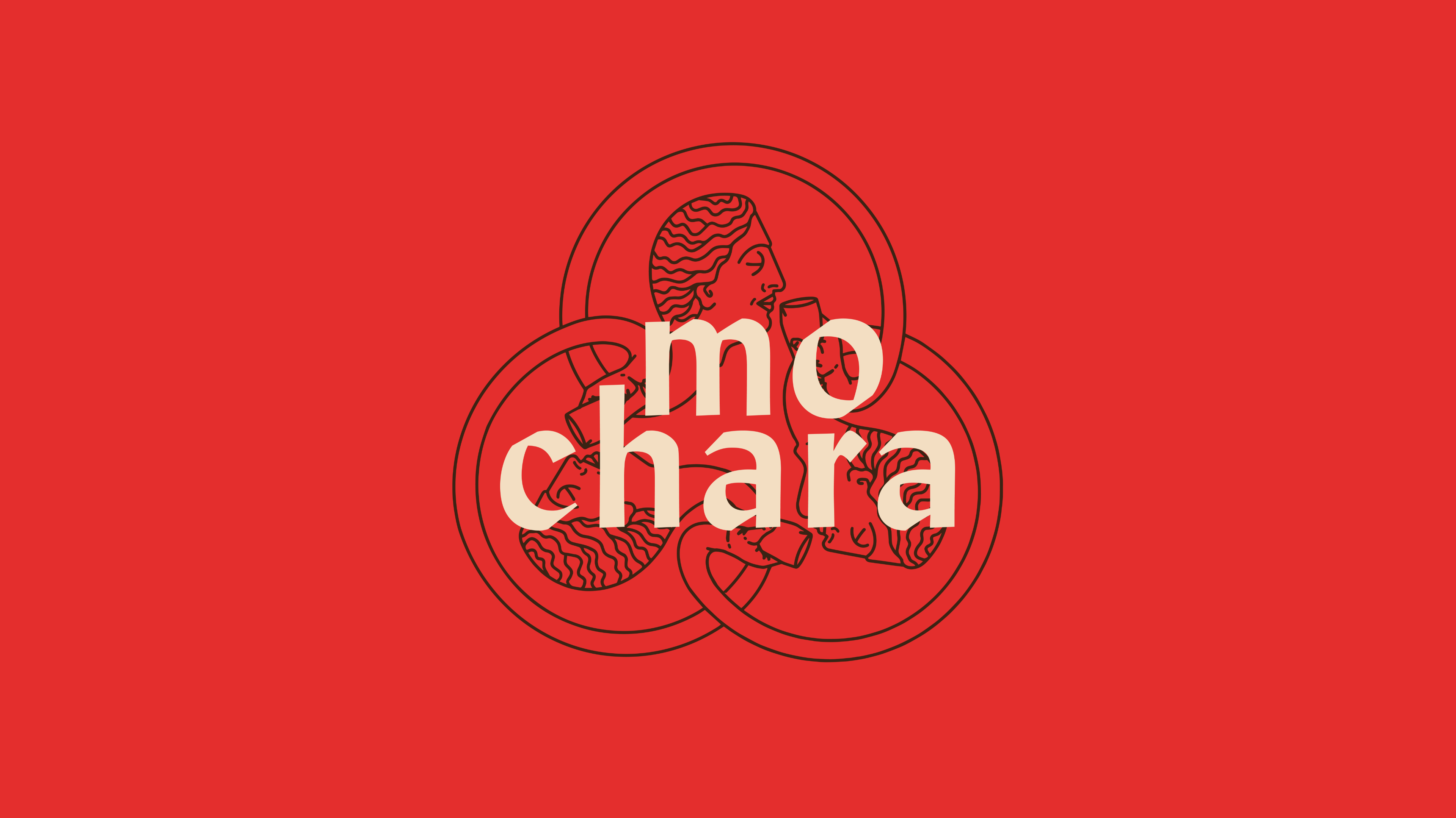
This round is on us. Mo Chara; branding Dundalk’s first taphouse.
Another season, another league title, another book for Dundalk FC.