
Re-defining the audience for Brigid Teevan; a relationship and sexuality educator.
Brigid Teevan is a relationship and sexuality educator. She works with the parents, as well as educating children on relationships and their sexual health.
It was important for Brigid Teevan when we did this rebrand to have an importance on being inclusive to all people, sizes, ethnicities and genders. With this, we created a welcoming and friendly identity that could showcase educational illustrations that are visually engaging for children, as well as expressive illustrations that are used as a personal style to the brand, to create a moment of pause between the informative and inject some personality into something that is educational for children.

It was important for us to be mindful that Brigid Teevan is changing the view on sex education. We aimed to build trust with the identity by encouraging parents and teachers to embrace the awkwardness of it. We also created playful and engaging copywriting to persuade her target audience — the parents. The tool that allows this to happen with authenticity is the typography.


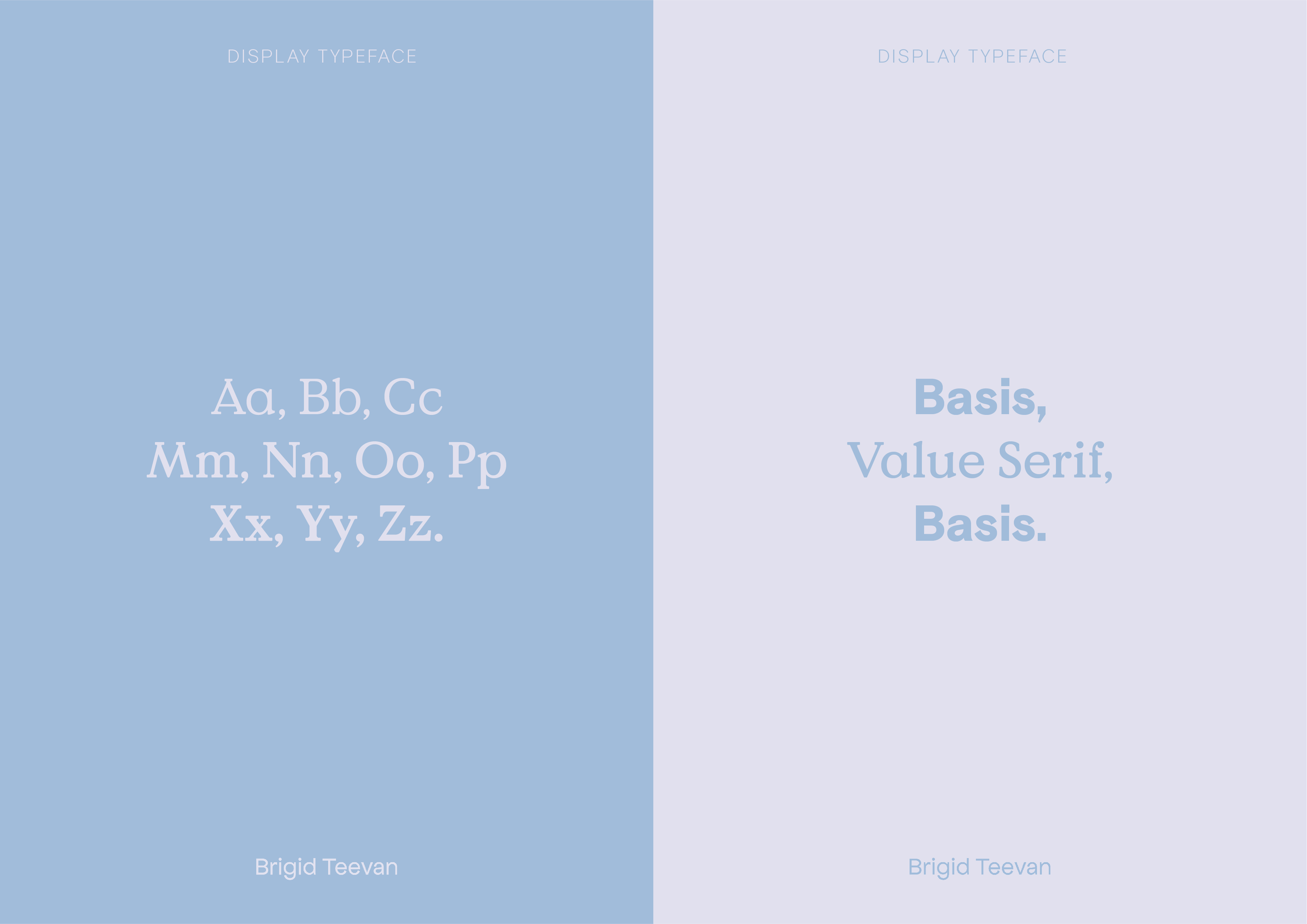

To match the tone of voice we used two typefaces in display purposes to highlight and embolden certain messages in our copy and to show the brands diversity. Basis Grotesque as well as Value Serif are used to contrast each other. The language is used to change parents views on sex education and embrace the awkwardness of it. We used two typefaces to highlight and embolden certain messages in our copy and to show the brands diversity.

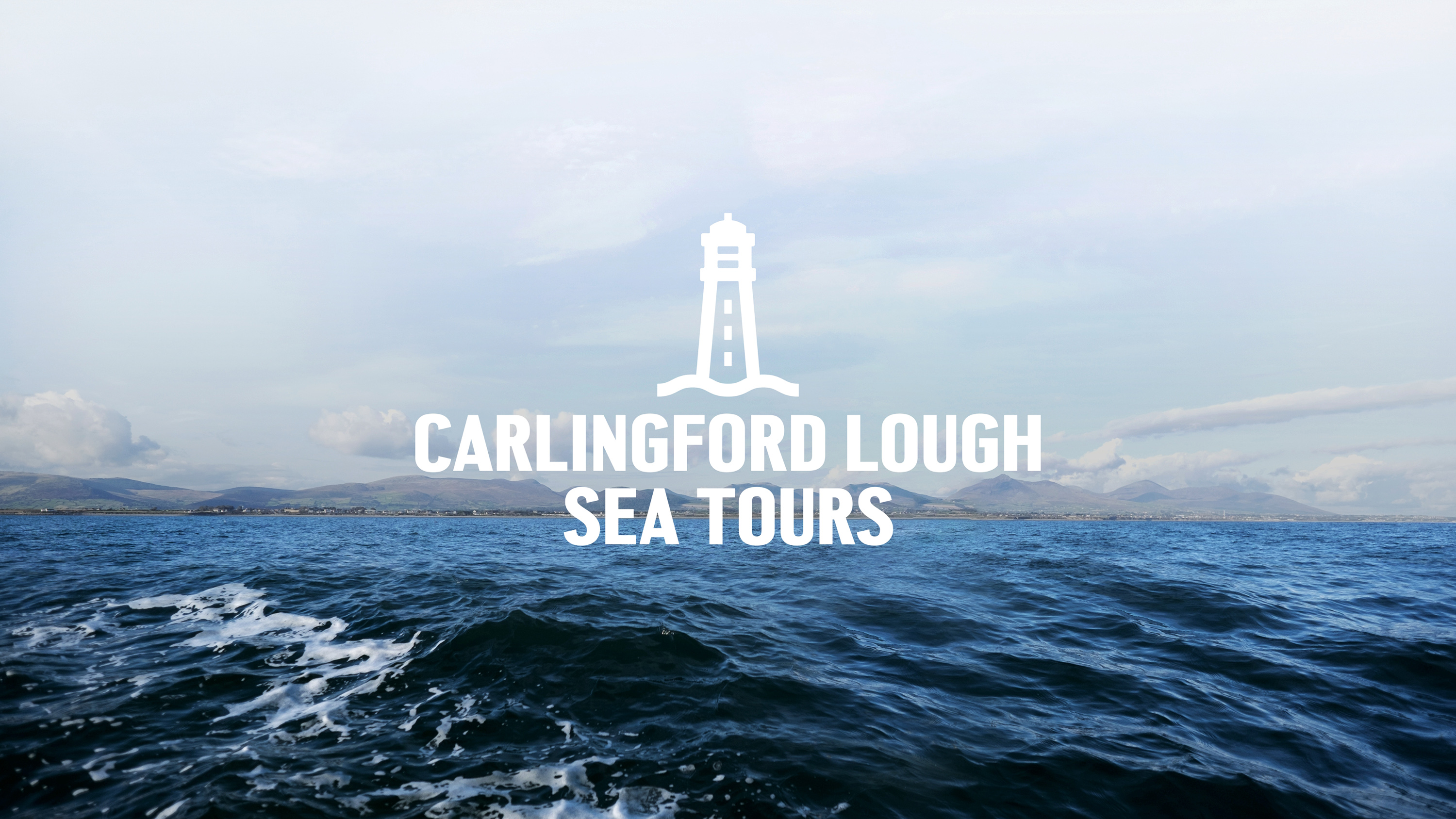
Capturing the spirit of the ocean for Carlingford Lough Sea Tours.
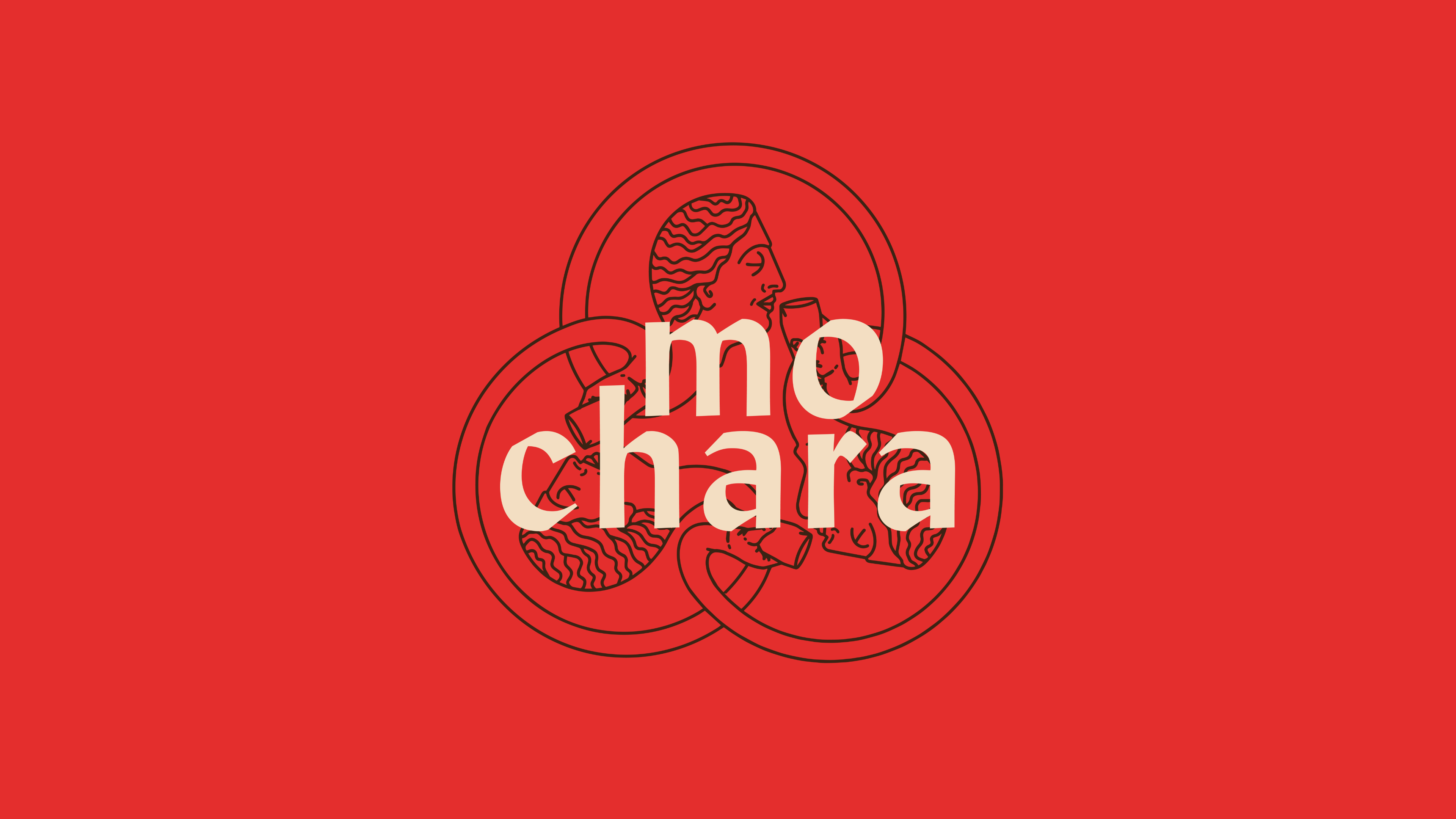
This round is on us. Mo Chara; branding Dundalk’s first taphouse.
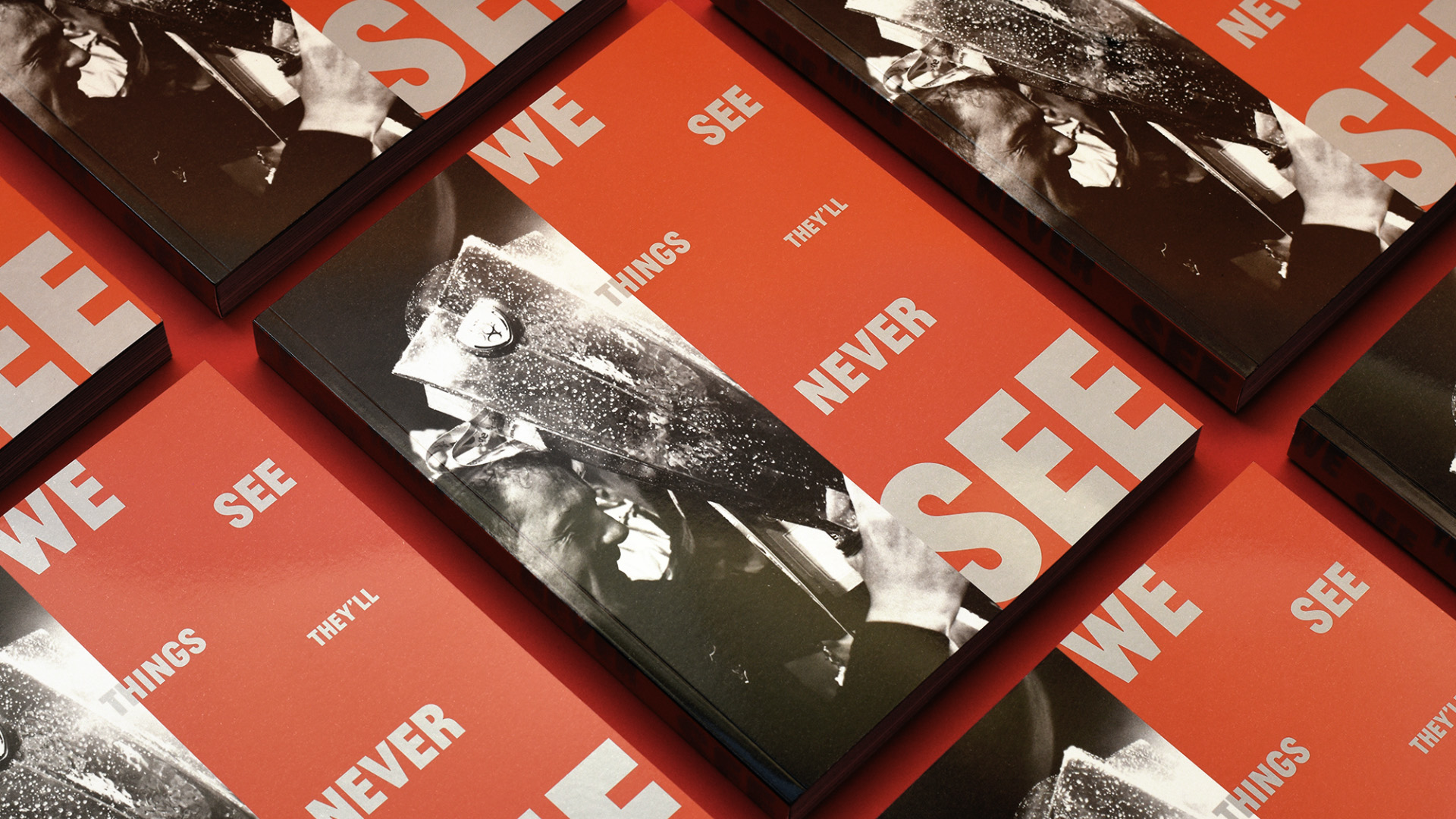
Another season, another league title, another book for Dundalk FC.