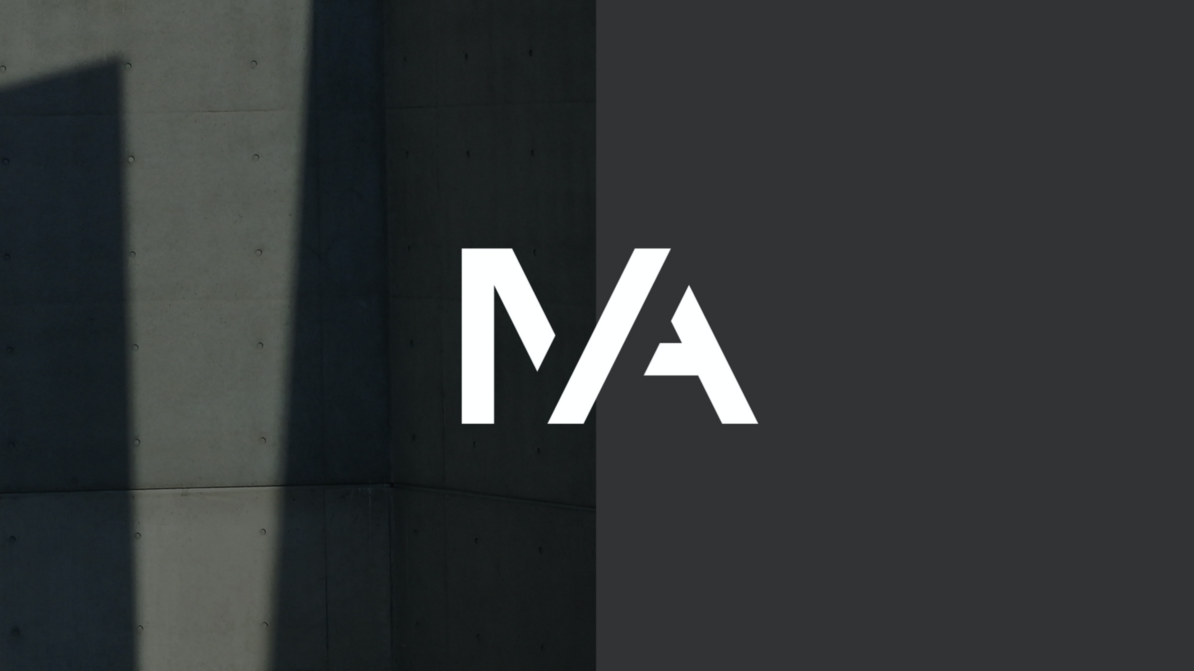
An identity inspired by light and shadow within the built environment for McGahon Architects.
A rebrand for McGahon Architects, a design-led, architectural practice based in Dundalk. An integral part of the rebrand was McGahon Architects wish to update the abbreviation of their name from McGA to MA.
We were tasked with designing a new visual identity which reflects the approach and ethos of the practice. Based on a shift in the practice naming from McGahon to M–A, we designed a robust logo marque to represent this, along with a sleek logotype conveying simplicity, proportion and elegance.
We represented this change with the creation of a robust monogram inspired by the light and shadows associated with the practice of architecture. The mark was then paired with a sleek logotype conveying simplicity, proportion and elegance.

Exploring the form and modernist logotype logo options for M-A, we looked at a large varriety of options before refining this down to a crisp logomark employing architectural angular form and shadow line to produce a solid unwavering mark.


The print application focused on using a range of paper stocks that were reflective of the mass and solidity of building materials, using debossed and embossed foil blocking on a range of applications. Printed by Plus Print on G.F Smith paperstocks – Plike and Woodside Pine. We also chose to use Craft Board, as a nod to the architectural scale models used by the practice.


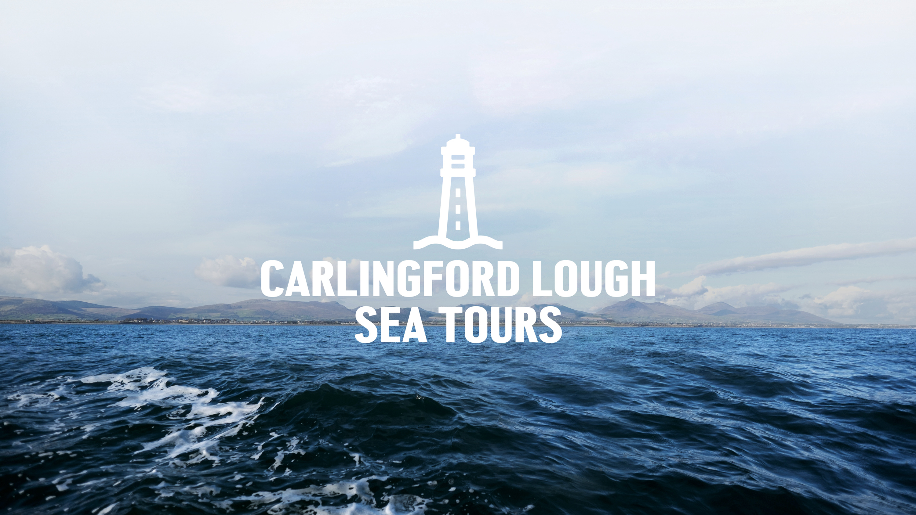
Capturing the spirit of the ocean for Carlingford Lough Sea Tours.
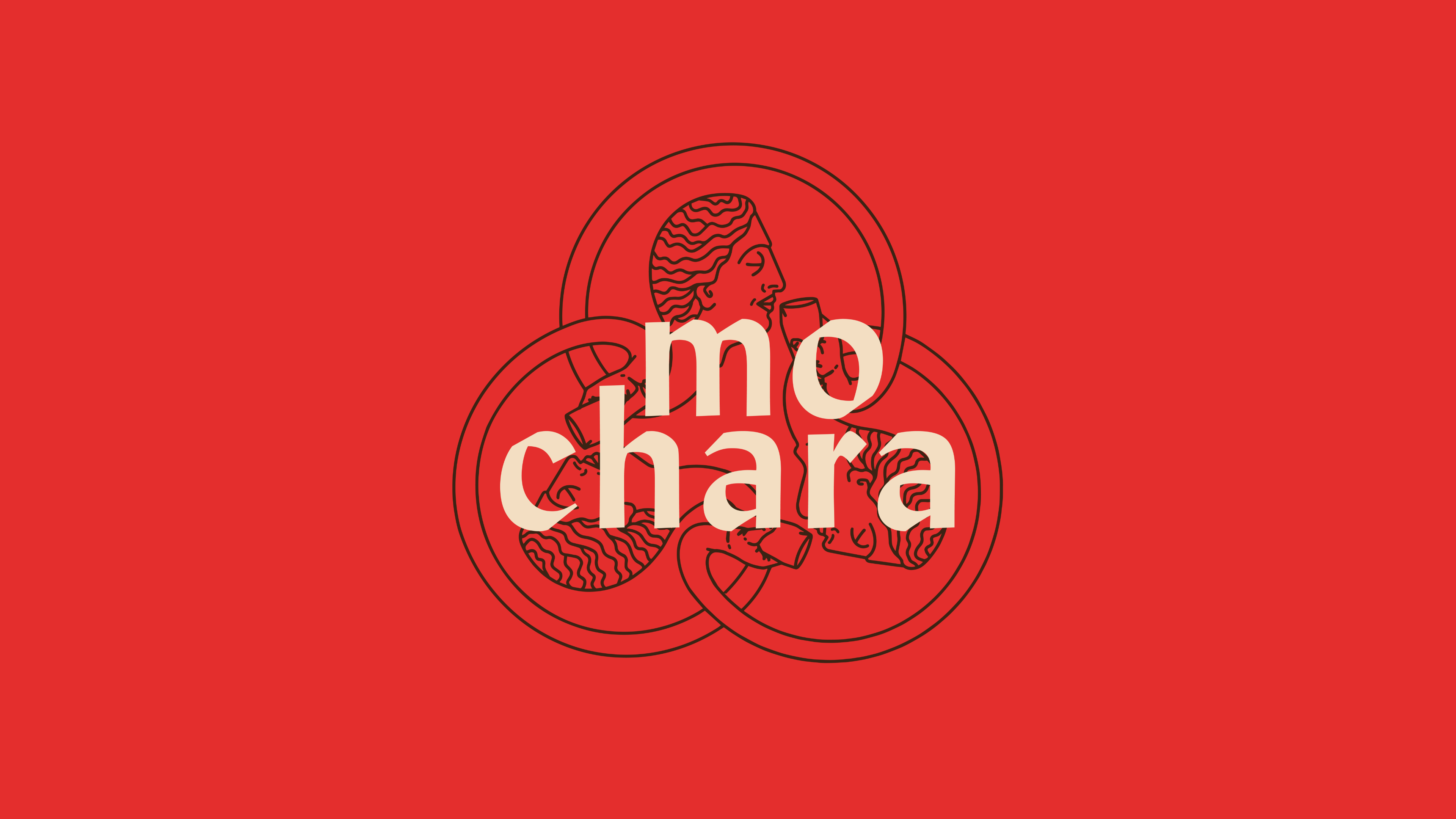
This round is on us. Mo Chara; branding Dundalk’s first taphouse.
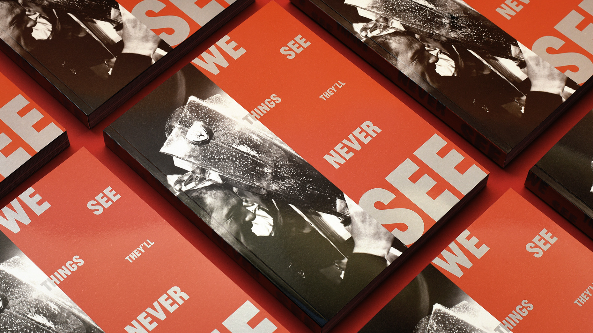
Another season, another league title, another book for Dundalk FC.