Shaping a durable future for Union; a designer and manufacturer of strength training equipment.
Union are an Irish manufacturer of training and fitness equipment, specialising in the design and fit-out of both commercial and home gyms.
Initially tasked with generating the name, Union was chosen due to it’s definitions having a connection to the product (the state of being strong enough to withstand the action of joining together), and also the idea of being part of a group and working out (a society or association formed by people with a common interest/purpose).
Want to discuss your project?
Lets talk


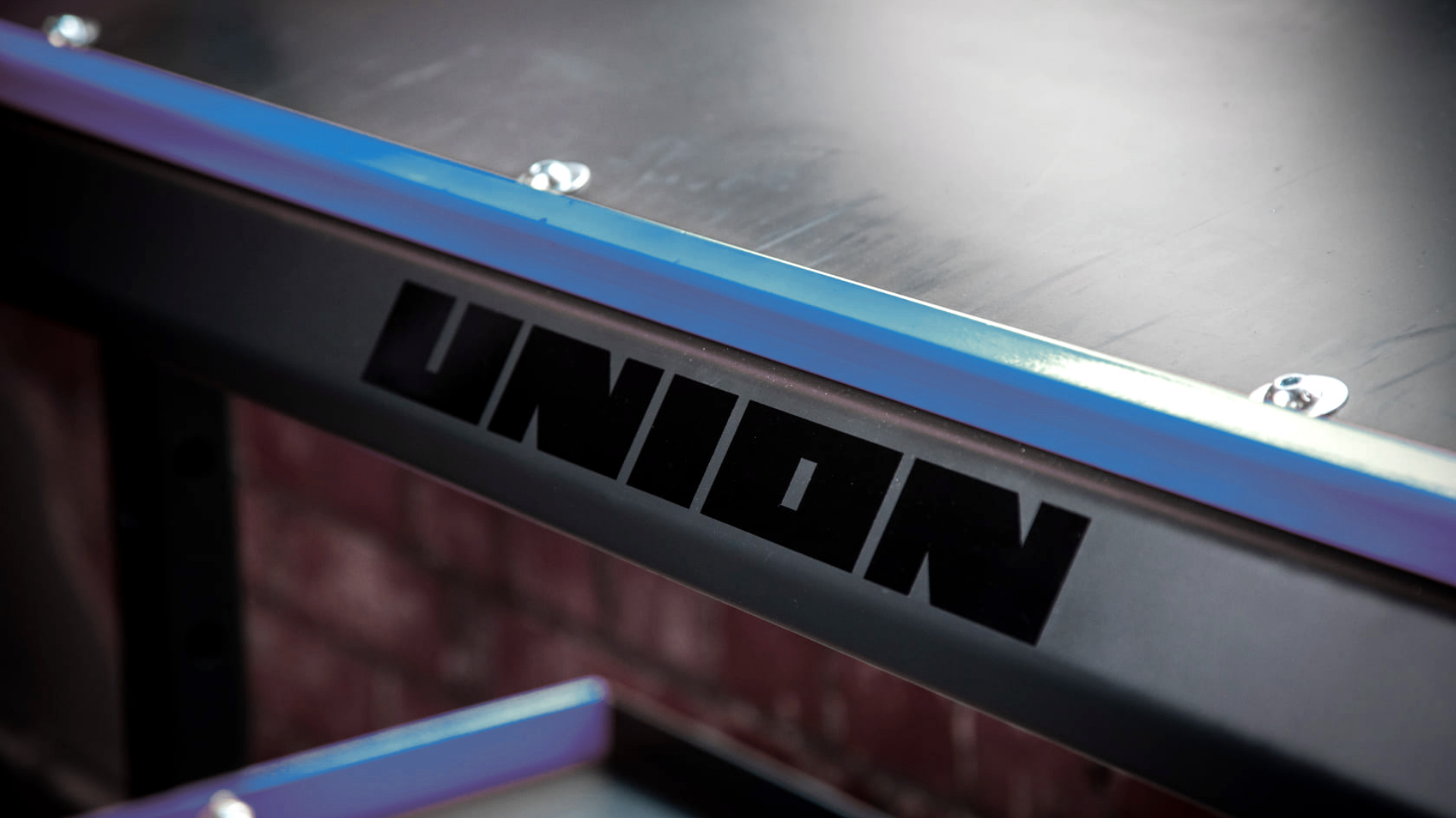
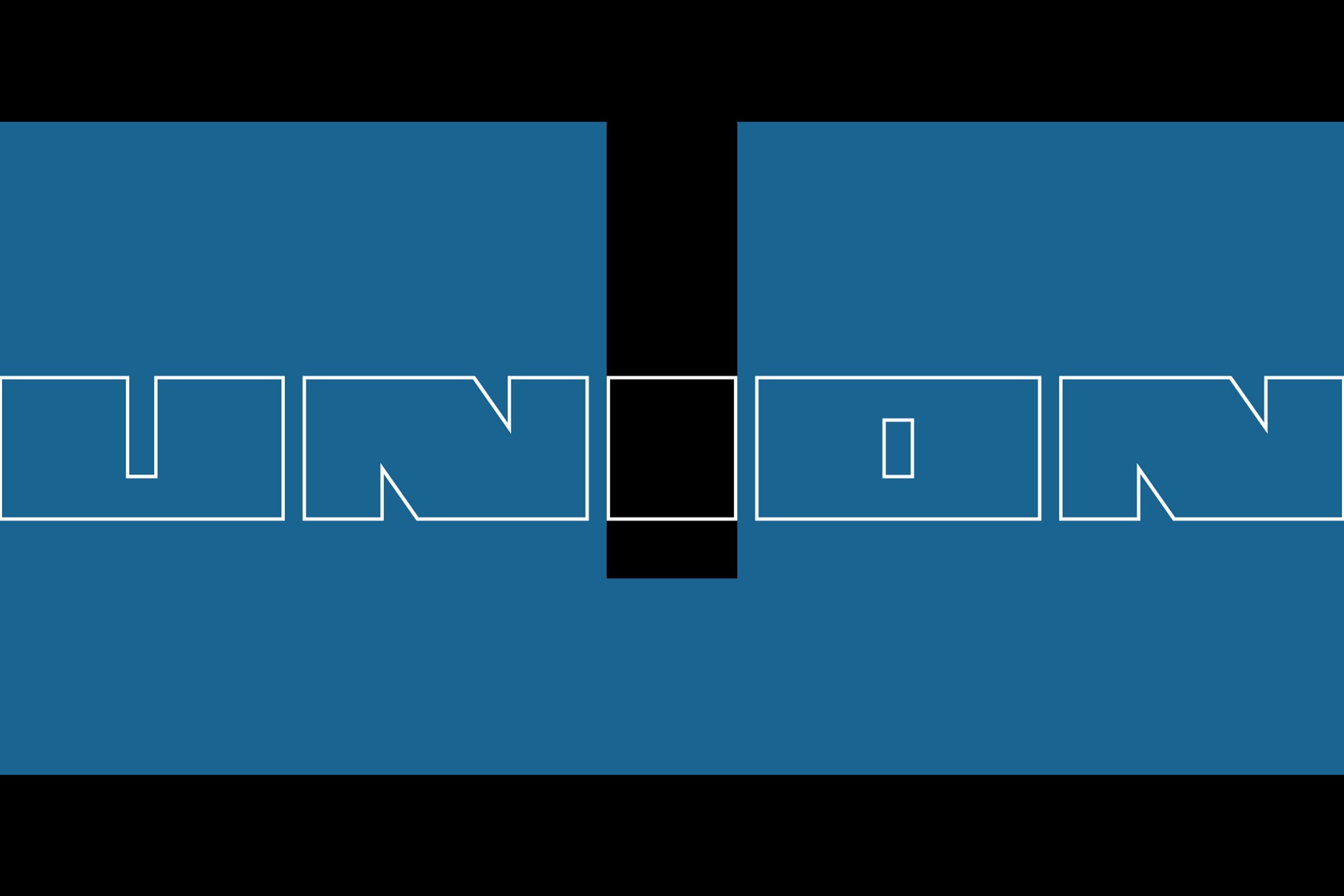
The identity itself, which includes a custom logotype, draws inspiration from the industrial steel manufacturers of a bygone era with the intention of evoking feelings of strength, quality, durability, and reliance.


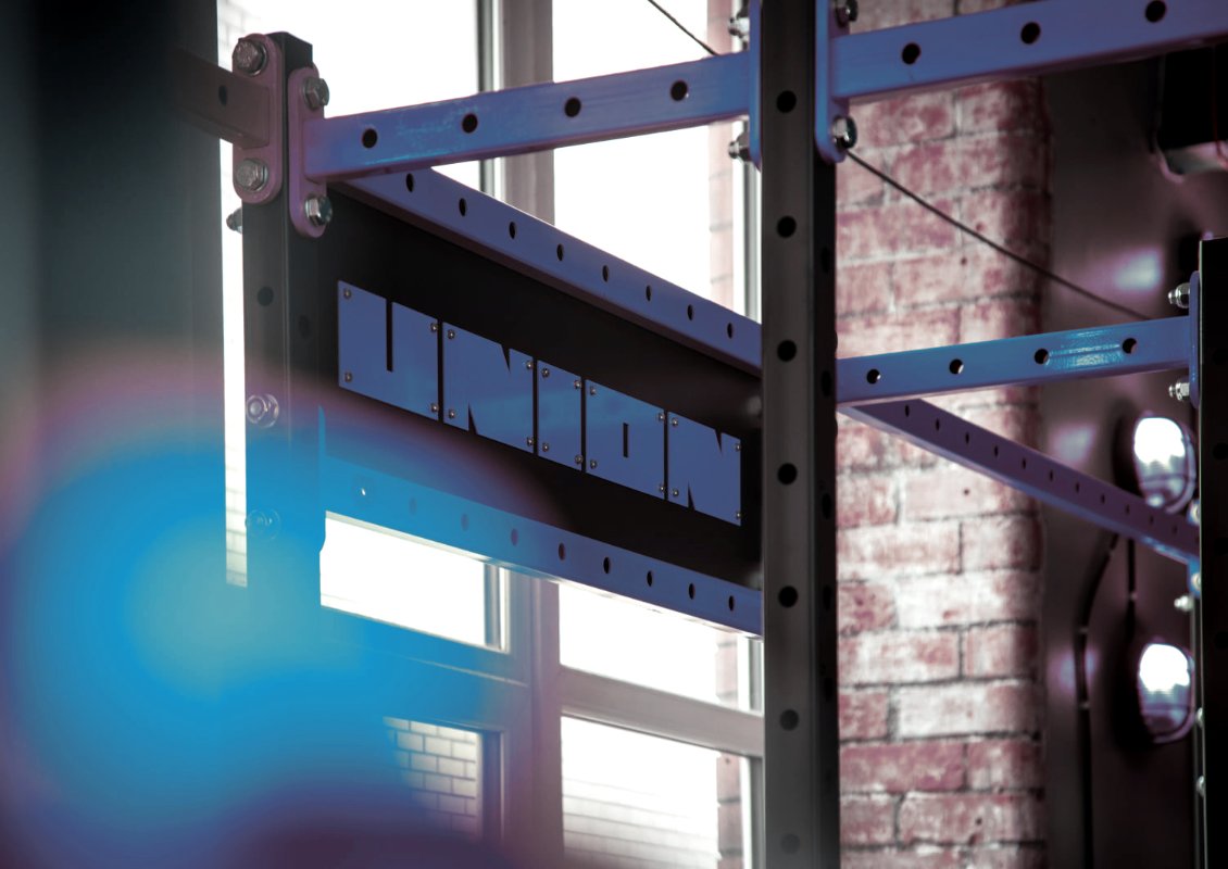
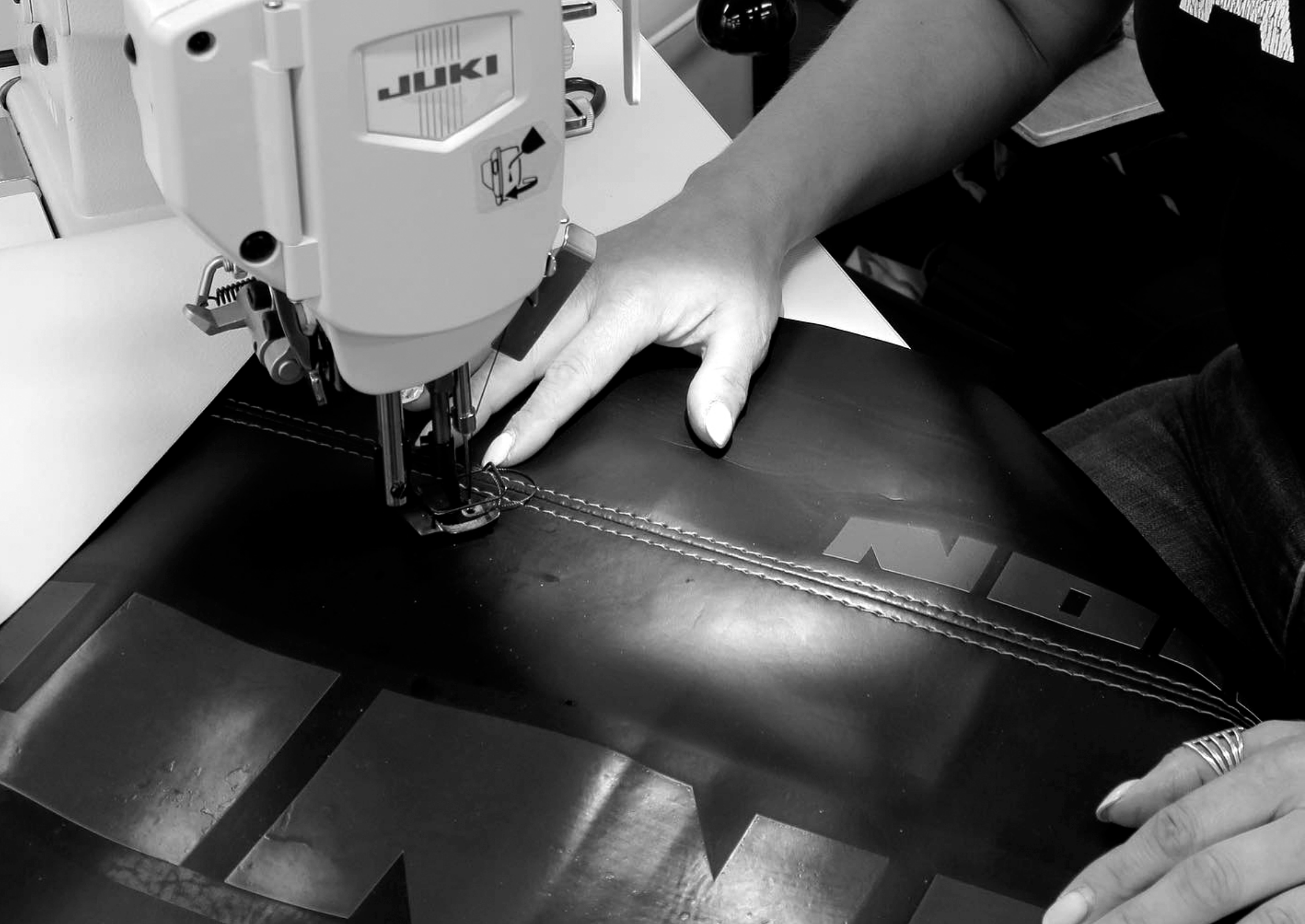
The identity for Union needed to be robust and fit for purpose, in this instance, dye stamping and cutting into steel. We created a logomark that would not be compromised by any application.

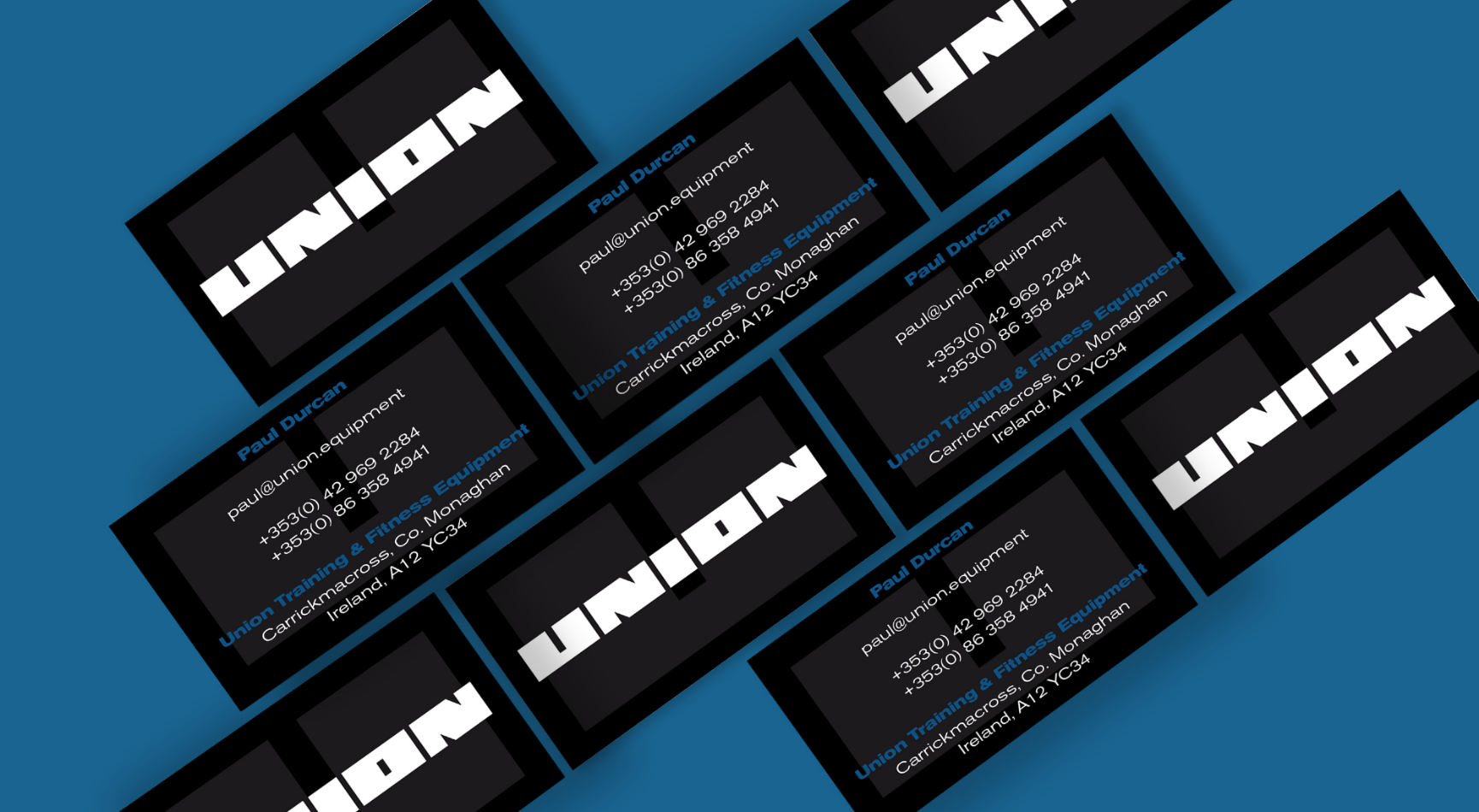


The brand palette for Union is reductive, solid and staunch. We wanted to keep it simple and 'no frills', with a hint of accent colour when required. Union colaborates with many other brands, so it needed to be flexible for co-branding, but still remaining distinguishable.


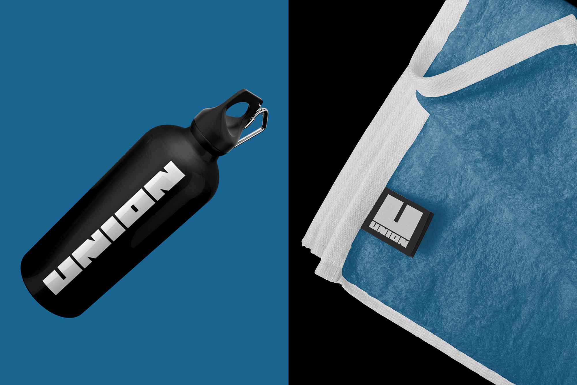
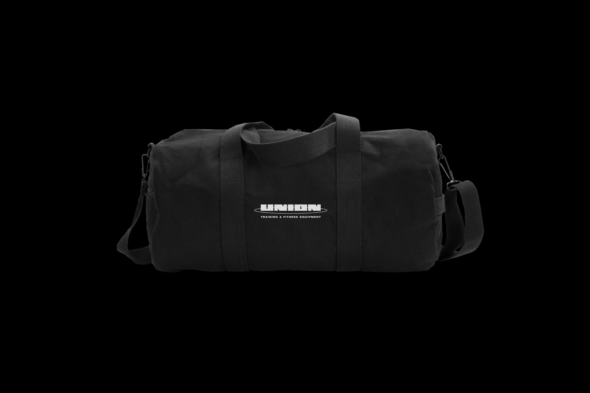


Expanding the range of brand applications from their main product, gym equipment, we developed a range of branded merchandise for Union.


The Union brand needed to be staunch and uncompromising, distinguishable within a training environment, and adaptable to include co-branded elements with the gyms and training facilities they produce for.


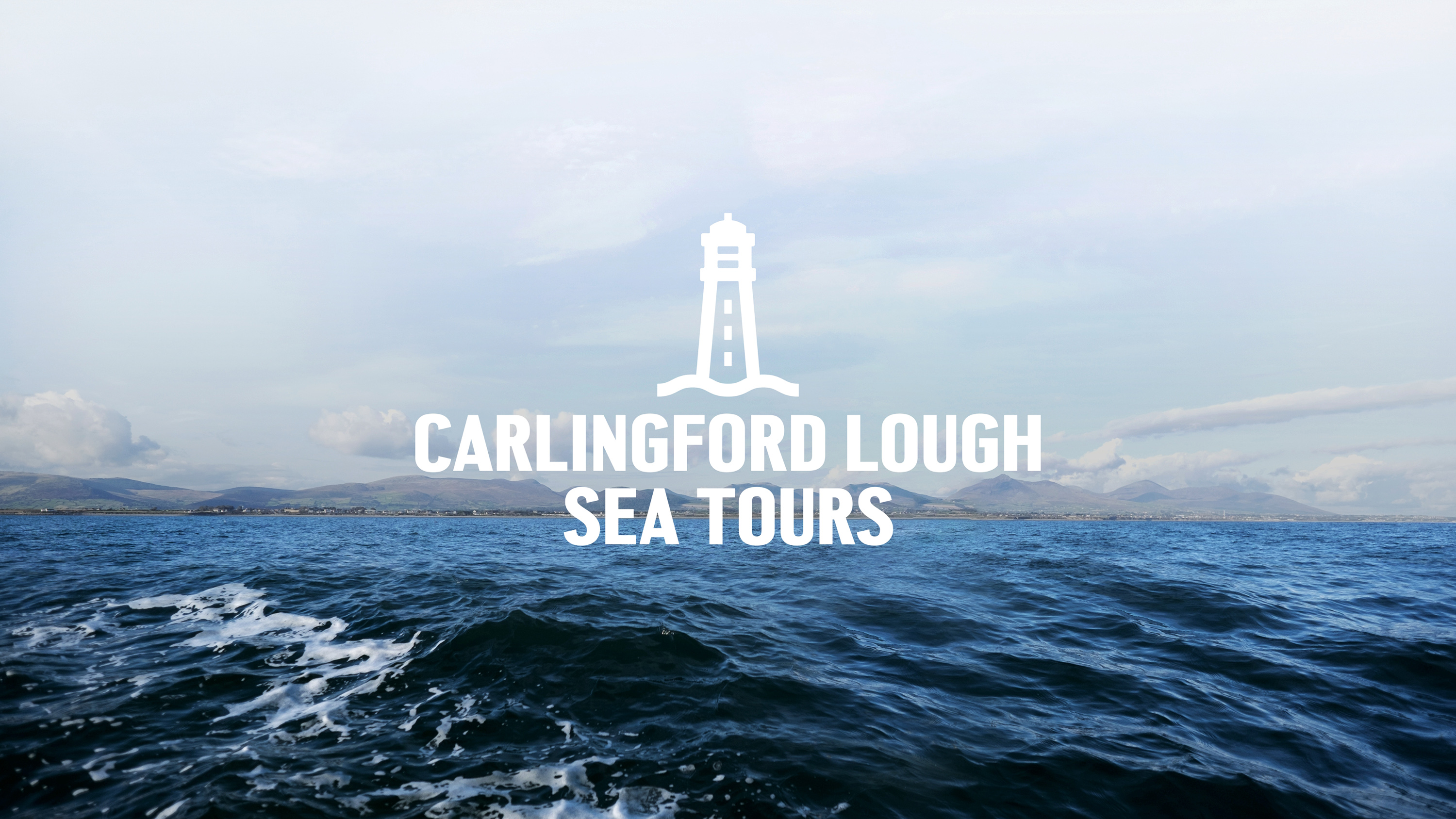
Capturing the spirit of the ocean for Carlingford Lough Sea Tours.
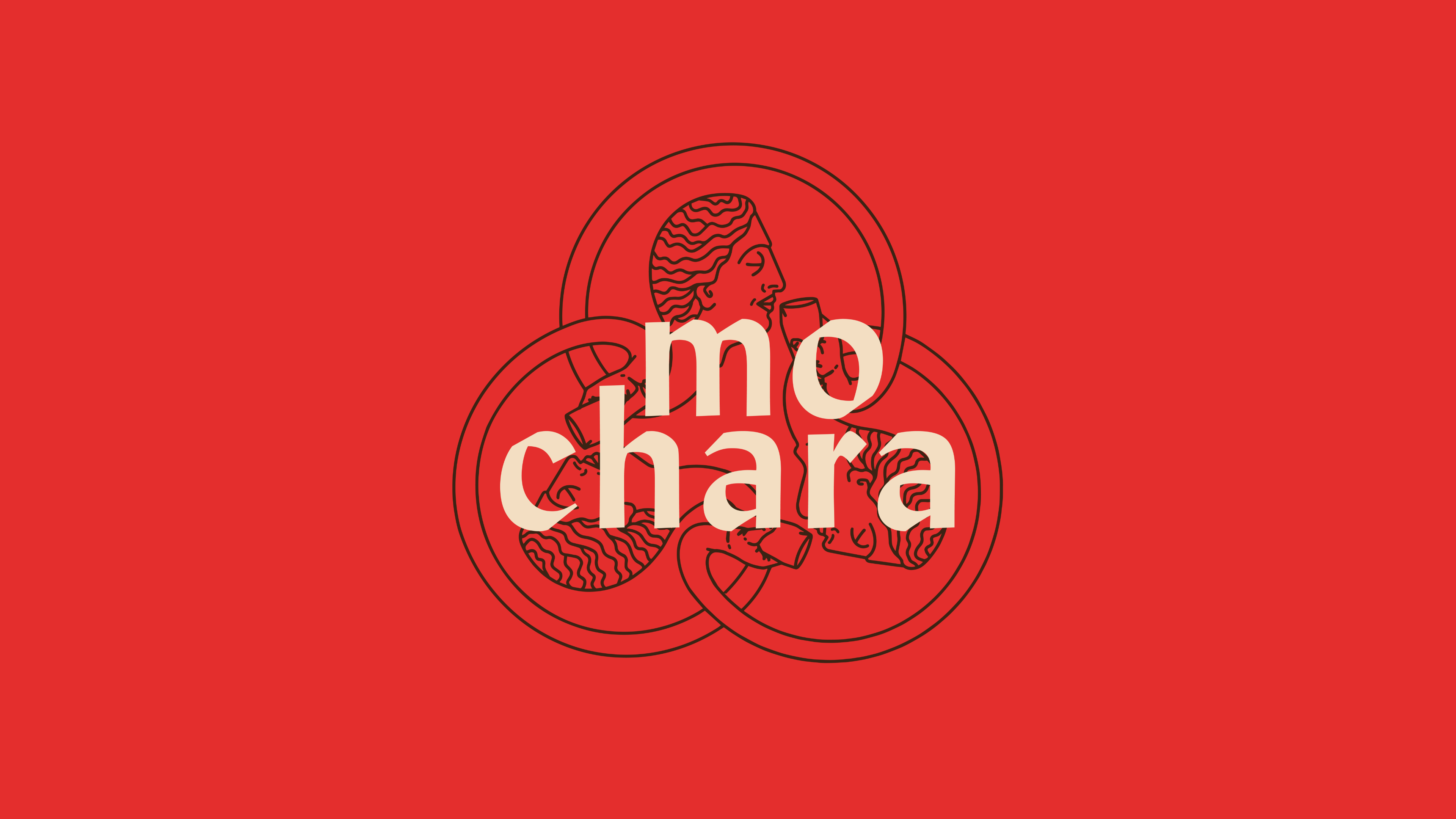
This round is on us. Mo Chara; branding Dundalk’s first taphouse.
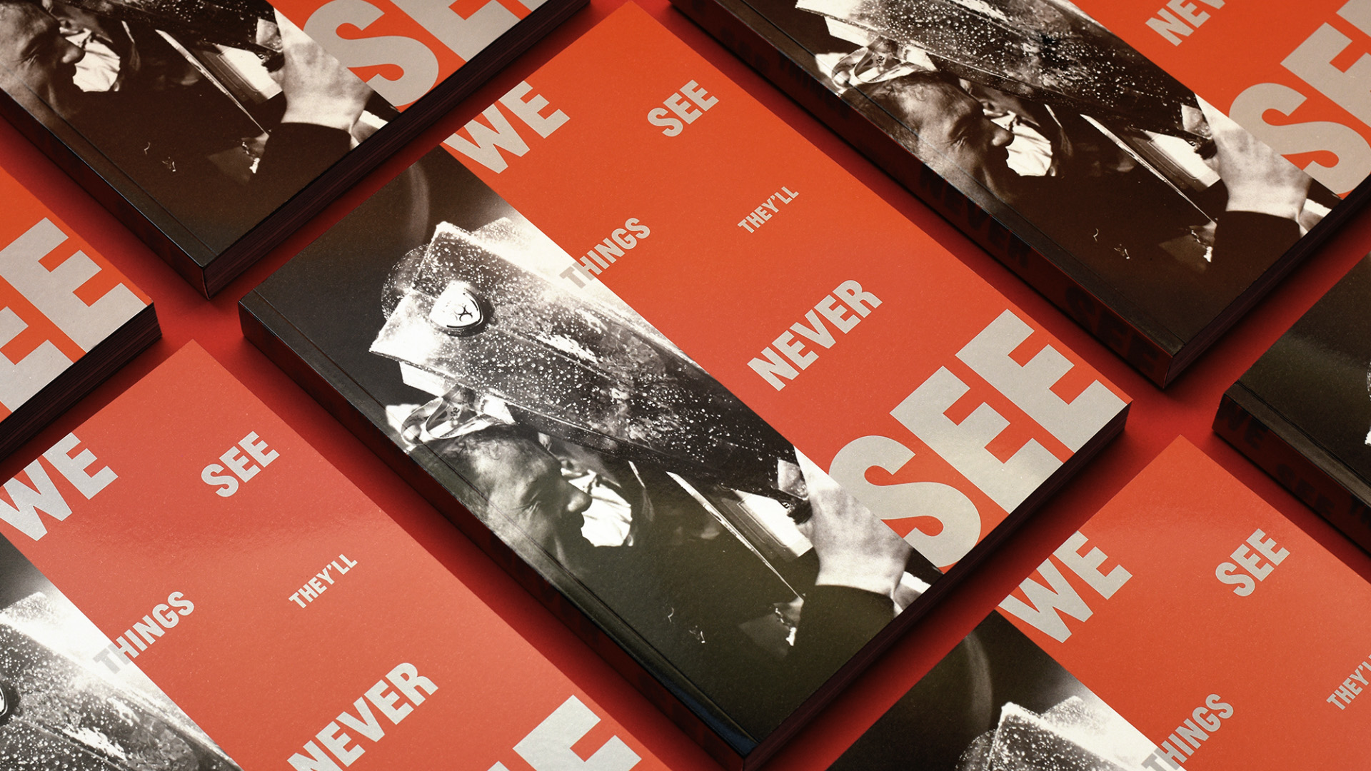
Another season, another league title, another book for Dundalk FC.